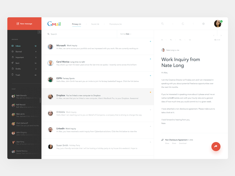
WordPress is now well into its second decade of existence, and oh how the Web has changed. One major area of evolution has been in the way designers approach their craft. For the better part of web history, designers have based much of what they produce on a small set of assumptions about web design.

Now the world’s favorite CMS platform, WordPress has helped corral the world’s bloggers into a certain sort of design consistency. In fact, you could say WordPress has helped form an international standard of web design. It looks something like this:
- Header
- Footer
- Content
- Sidebar
In the last few years, however, a growing contingent of web designers has been challenging that status quo. Rather than framing their creative endeavors from within a context of a fixed structure, they’re basing their design decisions on website objectives.
Viewed from that perspective, the sidebar debate takes on a whole new angle.
The Sidebar Question From a Different Angle
Begin with the primary objective of your website. Use that as a filter through which all design decisions must pass. Ask yourself if each element of the design is going to help further your mission to achieve the goal of the website. If not, change it and find one that does.
Use this decision-assisting filter on every page you design, too. Sidebars may work for some pages but not others.
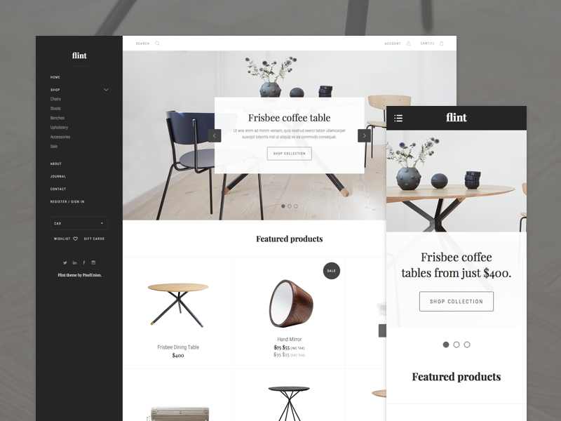
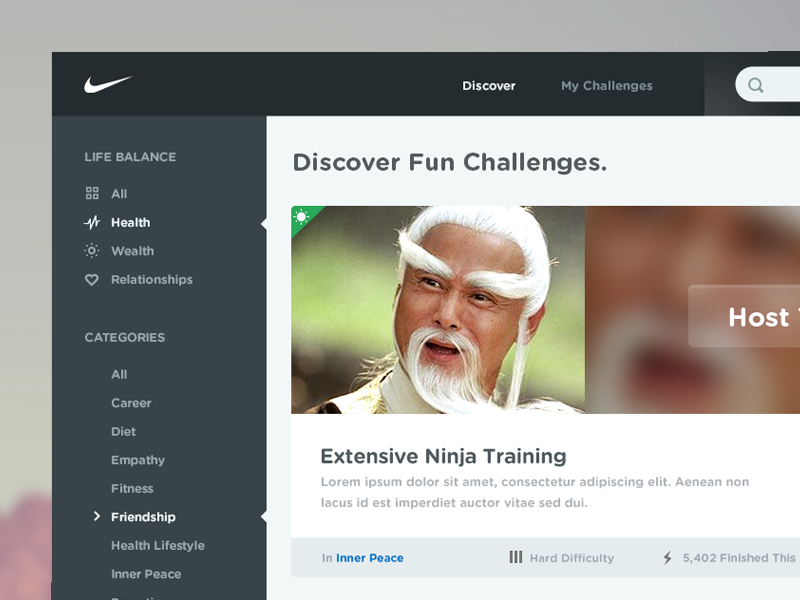
For example, if your primary objective is to sell a product, a sidebar on a product page is only going to distract consumers. This is why most large online stores use the occasional sidebar to work in conjunction with their fixed navigation bar. The side navigation bar will only appear when consumers are finding/searching for products to purchase. I.E. When a user clicks past a fashion home page on “products” a side navigation is helpful to categorise or “filter” options in order to make it an easier (and faster!) online shopping experience for the consumer.
Here are some examples of this premise:
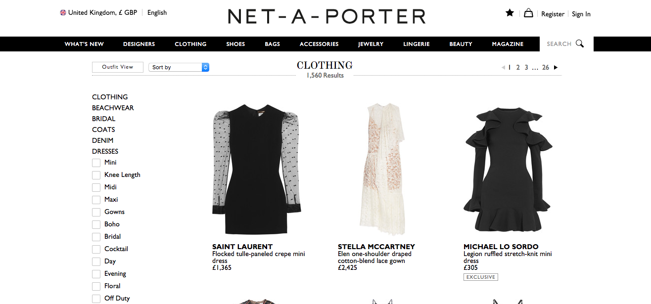
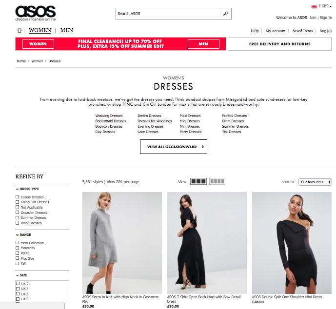
For the most part fixed navigation is probably the most used and sensible choice but that being said, most websites really benefit greatly from using an additional side navigation in conjunction with the main navigation bar.
It’s still good to know the general pros and cons of the sidebar, however.
The Disadvantages of a WordPress Sidebar
1. Sidebars Can be Incredibly Distracting
Let’s say you worked hard to get someone to click to your website to read your fantastic content. It doesn’t really make a lot of sense to distract them with links, ads, GIFs, or other sidebar nonsense, does it?
2. Sidebars Can Easily Get Filled up With Junk
If you’re not careful, the sidebar on your WordPress site can become the design equivalent of your garage. You simply throw everything in it which doesn’t count as primary content. Garages house our toys, our tools, and other non-essentials. Same with sidebars.
It’s even worse if you have multiple sidebars. It seems the makers of WordPress never intended for the sidebar (or proliferation of sidebars) to become the placeholder(s) for junk. In their own words…
“WordPress was born out of a desire for an elegant, well-architectured personal publishing system…”
Having junked-up sidebars or multiple, confusing sidebars is hardly the pathway to creating an “elegant, well-architectured” website.
3. Sidebars Often Contain Redundant Information
Take a quick survey of websites and focus on what’s included in sidebars. Chances are you’ll find that much of the information included in sidebars is also available in other places on the site.
Unnecessary, awkward duplication like that is not the road to elegance, simplicity, and ease of navigation that most web designers strive for and most clients demand. It’s just bad UX.
4. Sidebars Are Not the Instant Conversion Magic Everyone Thinks They Are
For a while, sidebars were considered magical in their ability to convert visitors. Then along came cluttered sidebars with all their distractions. Finally, people have become wary of sidebars and their dubious content because of sites who use them for click bait purposes.
All you have to do is take a quick online tour of news sites and you’ll see what happens whens sidebar-based web design looks like when it hits bottom.
The result? Sidebars just don’t convert like everyone thinks they do. Countless businesses have upped their conversions by taking their CTA out of the sidebar, in fact. VideoFruit improved conversions by 26 percent. IMPACT Marketing improved theirs by 71 percent!
If you haven’t carefully considered your sidebar and justified its very existence ten times over, then your website might be falling victim to one of the above problems.
On the other hand, a carefully considered and well-planned sidebar may have some advantages…
The Advantages of a WordPress Sidebar
1. They are Sometimes Pretty Useful
For viewers, there’s something reassuring about the handiness of a sidebar. Having all that information right there next to the content makes navigation easy (assuming that’s what you’re putting in your sidebar).
In fact, many visitors will be so used to sidebars they may even feel lost or frustrated with a minimalist site where the sidebars have been ditched. Moral of the story: if you ditch the sidebars, make darn sure you’re providing easy navigation or information elsewhere on the site.
The header comes to mind as a great place, as does the footer or post footer. In fact, more and more these days we’re seeing the loaded footer, so many users are now trained to scroll downward rather than upward to find what they’re looking for.
2. Used Strategically, they Can be a Great Place to Promote Your Objective
Sidebars are still, in many cases, a great place to place your social media icons, your email signup form, your bio, or a featured product or service.
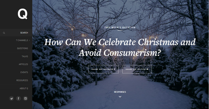

Sidebars or Not? Wrong Question
If you’re now wondering whether to use sidebars, you’re on the right track but you’re not asking the right question. The real question is whether a sidebar — or any other design element, for that matter — contributes to the primary objective of the website you’re creating.
As we covered earlier, these days, web design more often starts out with a question:
What do I want/need this website to do for me?
Here at CodingAli, we’ve gone through several iterations of sidebar status with our web designs. At the moment, they’re serving their purposes (with responsive web design) so we’ll stick to using them in synchrony with a fixed navigation design. But since we’re always split testing, we’re always open to the fact that someday, somehow, those sidebars may stop working for us, so out they’ll go. Remember, it all comes down to whether your primary objective is served.
How about you- what’s your website objective and how has it guided your sidebar design decisions? We’d love to know!
