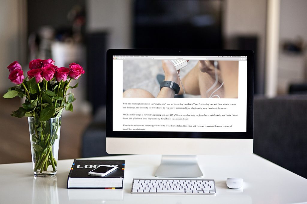
With the stratospheric rise of the “digital era”, and an increasing number of ‘users’ accessing the web from mobile tablets and desktops, the necessity for websites to be responsive across multiple platforms is more imminent than ever.
FACT: Mobile usage is currently exploding with over 20% of Google searches being performed on a mobile device and in the United States, 25% of internet users only accessing the internet on a mobile device.
What is the solution to ensuring your website looks beautiful and is active and responsive across all screen types and sizes?! Let me elaborate!
USING RESPONSIVE PLUGINS
There are so many plugins available on the world wide web.
Plugins are essentially software that you can download and attach to the back end of your website. They provide additional features, optimising the way your site operates.
Below I have listed a number of plugins which, once downloaded, will allow your site to become functional across multiple platforms.
When choosing which plugin to use, try and select one that also adds an aesthetic element to the front end of your site. After all, this is the part that your users actually engage with.
Jetpack: With over 33 specific features, this plugin is perfect for making your WordPress site mobile friendly. What’s more is it is free, so perfect for small start-ups, blogs or businesses that hadn’t envisaged a large spend in this area!
WPtouch mobile plugin: Used by more than 5.5 million blogs, this plugin offers a unique user experience to desktop and mobile users. It also has an add-on (enable server-side optimization) that allows you to supply templates that are specifically designed for mobile devices, by detecting when a mobile device is accessing your site.
WP Mobile dector: This plugin is the best choice if you have a non-smartphone audience, as although for some of us it is hard to believe, many still use ‘normal’ mobile phones! Its software will detect whether a browsing request is coming from a smart phone OR a standard mobile phone and It then directs your website to load the relevant compatible mobile theme.
RESIZING IMAGERY
Ensuring your content and imagery shrinks or is rearranged proportionally when your site is accessed from different screen sizes, is another tool to add to your box to ensure your site is easy to navigate across multiple devices.
This can be done quite easily by adding the following code to style.css:

This code declares that images should be displayed in their original size until their container element (or the screen) puts a limit on that size. This is what happens when the site is accessed from a mobile device where the screen size is smaller.
Of course, you also need to have a look around the stylesheet to ensure no other declarations are in place that might overwrite this, otherwise it should function perfectly!
AVOID USING POP-UPS
Here’s the big news, Google has started to penalise sites with very intrusive pop-ups that cover the majority of the site’s content. GASP! Don’t worry – this doesn’t apply to pop-ups asking your users to subscribe to your email or newsletter correspondence!!
Most pop-up providers provide optionality that allows pop-ups to be disabled when your site is accessed from a mobile device! I highly recommend taking advantage of this opt-out functionality, allowing you to customise which devices the pop-ups appear on.
MY FINAL TIP: TAKE THE MOBILE FRIENDLY TEST
If you would like to check whether your site is now officially responsive over mobile, check out this amazing Mobile Friendly Test Tool – powered by Google.
Creating a website with responsive website design in mind, puts you leaps ahead of most of your competitors. What’s more, is it positions your website to seamlessly cater to newer devices that users use to surf the internet – think smartwatches & IoT devices.
Websites that aren’t mobile-friendly are quickly becoming defunct within our fast-evolving digital landscape. Having a responsive website is no longer simply a nice feature, rather, it’s now a necessity, and may affect the growth of your business.
The experience users have while they visit your site, directly impacts how you grow, convert and retain your user-ship and following. After-all none of us like having to zoom in 100x or scrolling side to side to read clunky text. If you haven’t already, implement my above suggestions stat! You can thank me later!